
The five worst home kits of the 2020/2021 Premier League season
The five worst home kits of the 2020/2021 Premier League season
Every year fans wait in anticipation for their favorite clubs to release their home kits for the upcoming season. The home kit is by far the most worn jersey for any team in a season and should well represent some aspect of the club, be it the colors, history, or culture of the club. In today’s post, we will look at five of the worst or most underwhelming home jerseys of the new season and rank them in no particular order.
Southampton

Southampton’s kits over the years have been very similar; however, most have all featured their signature vertical stripes. This year the club has decided to change it up a bit and in their fifth year with their sponsorship with Underarmor, go with a simple one slanted white stripe. Personally, the white around the club’s badge is a touch of classic kit design but going away from their iconic red and white stripes make it look more like a kit purchased outside the stadium rather than inside.
West Ham
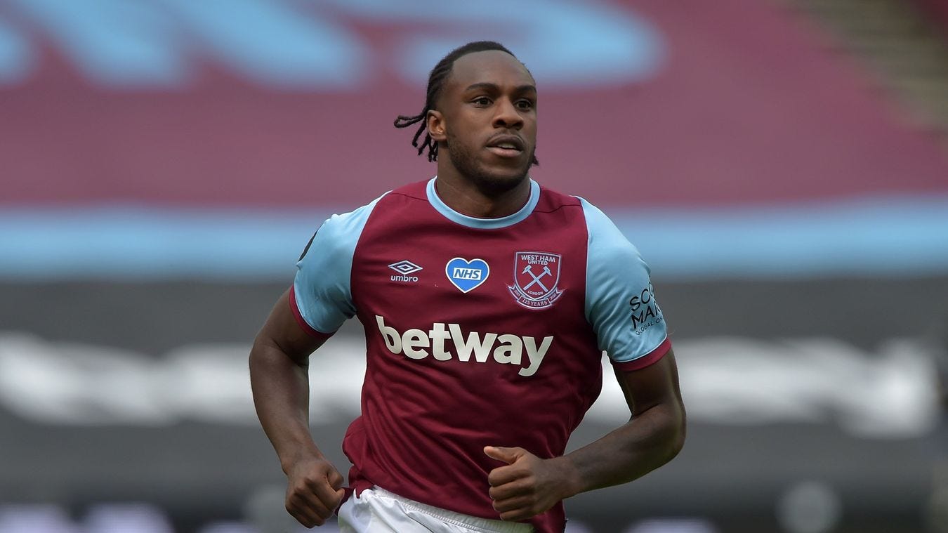
Similar to Southampton, West Ham haven’t strayed much from one design for their home kit over the team’s history. Though the colors have always been the same over the years, six-year kit maker Umbro has done well to freshen up designs each season. This year they might have dropped the ball going a minimalistic, simple design. Even though simple can work too simple can look like they didn’t even try. In fact, at first glance, the Hammer’s home jersey could be mistaken for a training jersey more than a game one.
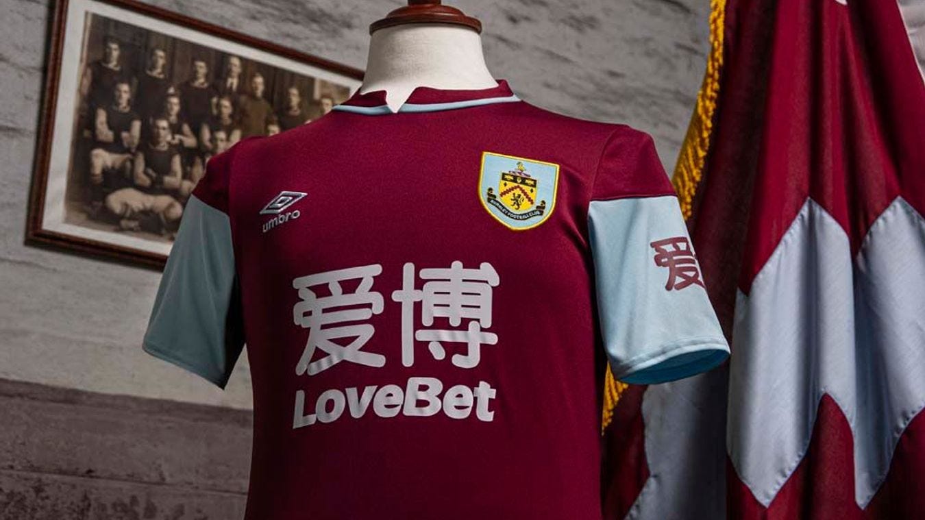
Umbro took much inspiration from the previous kit of West Ham to the point where the difference between the Hammer’s and Aston Villa’s new home jersey is very slim. Add on the massive shirt and sleeve sponsor of Asian betting company LoveBet, and the kit looks more like a billboard than a game shirt. The collar of the shirt is also a questionable style at is not the conventional crew cut you see these days. Umbro has produced some excellent kits over the years; however, it seems that they fell short on this one.
Aston Villa

Why not one more claret and blue jersey for the Premier League? This one brought to you by Kappa. Even though Kappa has made some iconic jerseys over the years, another claret and blue kit in the Prem is hard to like. Personally, Aston Villa’s kit far outweighs all the others, as I think most people would say. However, the only reason that it makes it is because of how similar it is to West Ham and Burnley’s kit. Villa did earn a new kit sponsor in British car company Cazoo and have incorporated it in a simple way. The Birmingham club earns the title of best of the worst amongst these five.
West Brom

Arguably the worst of the worst, West Brom did well last season to earn promotion; however, Puma did not give West Brom a respectable home kit for the 2020/21 season. Though it has some remnants of Aggies’ historic navy and white stripes, the intermittent stripping on this one makes it look strange. Puma usually makes quality, well-designed kits as they sponsor three other teams in the Premier League. Sadly West Brom’s kits do not get much better when it comes to their away and third as Puma decided not to switch up the design but to add in the weirdest color combinations. The Hawthorns may be seeing top-flight football again this season, but by all means, are the jerseys that their beloved team is wearing ideal.
A lot of thought and design should go into creating any jersey for a football club, especially the one worn in front of the home fans. Though the Premier League has many great kits this season, these five are among the blandest and bizarre that the league has to offer. Thanks for reading.